At WooThemes, in addition to educating and empowering ourselves and you all, our beloved readers and customers, we are passionate about giving back and inspiring social change. We champion and embody our cause every day- to help.
You’ve got a cause that you’re really passionate about. You’re working all day, every day, drumming up awareness and raising funds for your cause through your Not-for-Profit organisation. Getting online is the next big step you need to take, in order to create global awareness for your cause.
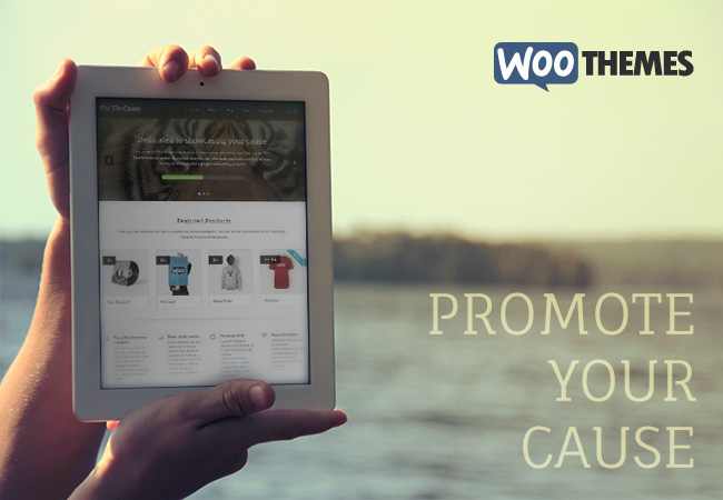
Today’s release is aimed at helping you to do exactly that. Everyone, say hi to “For The Cause”, our latest WordPress theme.
Standing For The Cause
While For The Cause can be used in any context, the design has been crafted towards helping NPOs showcase their cause, how far they are towards achieving their goals and promoting various offerings and goals they’d like to showcase to the world.
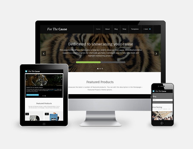
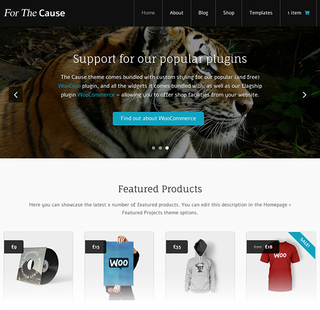
Designed by Chris Rowe, For The Cause can be shaped and crafted as desired with a few small tweaks in a child theme, or using the in-built theme styling options.
With the store functionality powered by WooCommerce, the entire WooCommerce extensions library is also at your disposal to take your online store to the next level.
Showcase your Progress
Included with For The Cause is a customised progress bar. Use this to display your progress on any task, either via a WordPress shortcode, a template tag (PHP function) or a call to do_action( 'woothemes_progress_bar' ) in your code. Simply tell the progress bar the total you’re looking to raise, as well as how much you’ve raised, and For The Cause will handle the rest.
Not just for blogging
While For The Cause is primarily a business and NPO-focussed theme, the design can be used for anything from a standard blog-style layout to a website showcasing your company’s range of high quality products. With styling support for our Features and Testimonials plugins, as well as a “Business” page template, your own design is just a few small tweaks away in the “Theme Options” section.
As long as you have content and a cause, For The Cause can meet your needs.
To illustrate this, we’ve set up a demo website to showcase For The Cause and to show off some wonderful imagery at the same time.
Create quick and simple styling adjustments
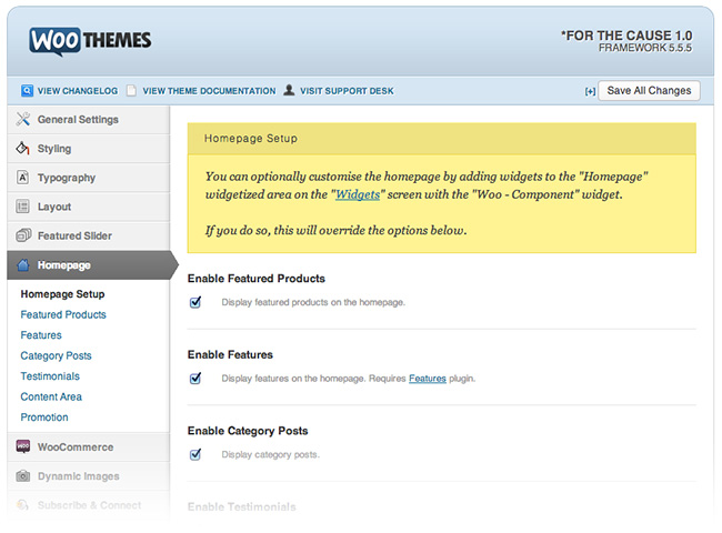
Customising your copy of “For The Cause” to meet your desires is important to us. With this in mind, no expense has been spared to ensure ease of use and customisation of the theme with a few clicks and your custom eye-catching imagery.
Quickly provide a unique feel on your website, using our tailored selection of customisation options. A few simple clicks, your logo and your branding colours can transform For the Cause into your very own, uniquely-branded, website.
Grab this theme with a 13% discount coupon, valid until 2nd October, 2013. Just use FORTHECAUSE13 as your coupon code on checkout.
About



Why all your recent themes look like something we’ve already seen? I can’t help but with every new theme I have the feeling that it’s a largerly recycled old theme… They all seem similar to each other and boring. They blur in one big blob of mediocre design.
We’re sorry to hear you feel that way, Johnny. Design is, of course, subjective. We understand this and we understand that not every theme is appealing to everyone. 🙂
Hi Matty,
Indeed, design is subjective but I’m not trying to say here that the themes are bad (I actually like their clean design and great code) but I’m trying to point out that the themes are similar to each other and kind of average. I very much miss themes that really stand out from others. Themes that are revolutionary. Themes that are not like others on the market. Themes that you remember because they stand out.
I enjoy your plugins though! Here you make really great work by constantly pushing boundaries of what is possible with WordPress. You include novel functionality and strive to provide a one-stop-shop for our needs. You experiment and surprise. I wish you do the same with the themes…
Very worthy feedback, Johnny. I really appreciate comments like this, thanks!
I don’t want to agree with Johnny’s comment, but I find assessment of the latest Woo Themes ring true with me too. It is easy to criticize, but borrowing Paula Scher’s words (http://t.co/VeuJXUWbCD), these designs are all very “solemn” but none are “serious”.
Solemn designed themes, like Woos, are well crafted, socially correct, accepted (see comments below by indigointernational) and effective (see comment below about sales). Solemn design maintains the status quo.
Serious design often happens “spontaneously, intuitively or accidentally” and usually comes out of play. It takes risks. It upends the status quo. It’s often flawed in some ways due to being the first of its kind. Serious design is about “invention, change and rebellion” not perfection.
And that is what is happening with most theme providers designs, not just Woo. I’m no different. Clients often want solemn but not serious designs. I’m sure that the more solemn Woo designs a theme, the more people that theme potentially appeals to and thus the greater the sales potential. The more serious a theme is, the smaller the audience and sales.
There’s obviously room for both serious and solemn themes from Woo Theme.
A very well structured criticism. I appreciate your thoughts.
Disclaimer: I still need to watch that video.
Perhaps whilst on the surface our latest themes could be seen as solemn, at the core I’d like to think the way we are engineering our themes is seen as serious product design. Often serious design is invisible. Our quest to compartmentalise functionality, and offer it as plugins, keeping the framework lean and the templates customizable.
We want to allow our customers to innovate on top of products, and like you say the more serious the theme is on the surface, the often more limiting it is in terms of customizability.
Without hiding behind excuses, we take this to heart, and are always trying to improve our offering. Stay tuned for our next serious theme 🙂
Speaking of compartmentalization and plugins, shouldn’t the Progress Bar feature of this theme be contained within a plugin (WooDojo probably) instead of a singular theme?
Such a plugin would make a great fit with One Pager for instance, as many campaigns are often about a single splash page serving up all the essentials on the landing page.
Your Cause is a fine theme, but the only thing that makes it a theme for campaigns & NGOs is the fact that it’s got that fancy would-be plugin of PHP code to make a progress bar.
More on that will be revealed soon. In short, it’s definitely planned! 🙂
I’m wondering if I should approach client theme selection this way:
1. If my client doesn’t have a budget that can handle customization of a theme (and even small customizations are expensive now with responsive themes), then I should head over to ThemeForrest where I can a design that is more serious right out of the box to meet their visual needs.
2. If my client has a large budget for customization, then Woo Themes would be a good place to start looking because the code, functionality and customizability are serious. I’ll then customize the hell out of the Woo theme to make it serious design.
Anyway, I look forward to some serious design coming out of Woo. Let me know when you think the visual design of a theme is serious.
What do you mean by “serious design”?
James, please see my comment above about the reference to serious versus solemn design by Paula Scher.
Totally agree with Dotp.
I’ve found that the vast bulk of WP themes don’t translate into business websites well – too fussy and the UX are dismal.
I’ve found that the “blander” the design , the more it appeals because it’s easy to modify and dress up. Woo themes are great starting blocks but you have to polish the site to make it glean.
I really hope Canvas 5.5 will have some tricks up its sleeve to accelerate the production cycle -it’s all about money.
Feel free to suggest ideas on Canvas here: http://woo.uservoice.com/forums/72423-ideas
You guys are AWESOME! I find myself thinking of ways that my site needs to improve, and then I come to you, and you’ve already created a new theme that does everything I’ve been looking for and more! I’m so grateful to have found you, and LOVE this new theme!! 🙂 Aimee
So glad that you like it! This theme was very fun to develop 🙂
It’s a beauty 🙂
Well done Woo!
Thank you, James! 🙂
Great theme. Will we see some the “moves” shown here work their way to Canvas 5.5?
Any specific “moves”? 🙂
Why not in our member panel ?
Sorry about that! It is all fixed up now.
I am always eager when i see a ‘new theme’ blogpost, but i can’t help feeling a little disappointed. You guys at woo do a great job and i can really agree with the things dotp states above, but somehow i always feel the designs are something in the middle of a ‘blog’ and an ‘ecommerce’ design. And when you don’t make a real choice between a blog/ecommerce site then you get a design what’s just that: not a blog design and not a ecommerce design.
It’s a pitty because i really believe in woocommerce and wordpress as an ecommerce platform. I also bought a shitload of stuff here but i just keep struggling with the competition such as open cart. When i show my clients a few examples of different shops and designs they always seem to like the opencart designs/themes better. Because they don’t want the fancy shit, they just want a good main stream shop, just like the others with some flashy banners and their products. Not a special top notch design, which is probably darn innovative and spectacular from the designers point of view but i think most clients see it different.
http://321theme.com/sellya/
http://themeforest.net/item/sellegance-responsive-and-clean-opencart-theme/full_screen_preview/1285060
http://themeforest.net/item/shoppica-premium-opencart-theme/full_screen_preview/235470
I don’t know whether this post has any influence at all, and i understand that it’s hard to compete with specialized ecommerce software but i just wanted to spit this out.
Just for the sake of this post not being a ‘whine’ post, I would recommend an idea to improve this. How about to just post 5 screenshots of a design and let your community vote? Do they like it? Ok, it get’s developed and your sure that you do a great job! Do they hate it? Fine too, you just go on to the next design and you don’t waste your time creating something that isn’t loved.
Seems a good solution to me, who’s with me?
“How about to just post 5 screenshots of a design and let your community vote?”
Cool idea!
I hate it.
And everything WooThemes does.
Haters gonna hate.
Wooooo… next is the Learning Theme?
What do you mean? Do you mean our learning theme we launched with full Sensei support? If so, that theme was Definition. 🙂
Sorry Ryan, I thought you were going to throw something like http://onvo.co.uk/Learning-Theme
I know the Definition, but it could launch a new theme specific for courses online.
Gilvan
Beautiful code is not enough. It can not be enchanted by the customer.
I do not know if it is just me but the responsive part of the website is functioning badly. No padding, no embedded video support(shrinking with the browser window), single posts are 100% width and the sidebar is thrown down below the content making the demo look like something a new coder has done. I mean even the author bio gravatar that is placed to the left of the box is placed there in all resolutions meaning it dissapears on the lower viewports.
The design overall feels like a rehash of your earlier themes. The Store is the part of the theme that has gotten most love it feels like. Single product pages still have the trouble as the single posts do.
Or I even found that you have trouble with the code if the browser is to small on how to handle the navigation and just about everything
http://sadpanda.us/images/1844095-RLAXKIH.jpg
That image doesn´t make the theme look good and if I had a company that wanted to make a webpage for my cause I would stay away from a theme looking like that.
So what I am trying to say is that after being hyped up for a new release from you after “Show Off” and “OnTopic” this comes as a rude awakening. What happend?
Be sure to remove the demo switcher and view the theme directly. That usually helps with most responsive issues –> http://demo2.woothemes.com/forthecause/
When the screen becomes narrow it doesn’t make sense to try and squish a sidebar along side the content though. That’s why the content area becomes 100% width.
There is the navigation issue right around the tablet size, and I see the padding you mention as well. I’ll report these for fixing ASAP.
It is true that squishing the sidebar together with the content on a mobile screen is not good design. But what I meant was not on the smaller screens but on the full screen version.
http://s9.postimg.org/o67cknfz3/woocoding_fail2.jpg for an example. Using Firefox 23.01 and using the “demo2.woothemes.com” site.
And yes, browsing the demo switcher on a tablet or mobile phones creates a bad image for the theme as it only has part of the screen workable without being able to scroll down(last time I checked anyway).
Good to know the development theme will get going to fix these errors!
Feel free to suggest improvements you’d like to see to our responsive design here: http://woo.uservoice.com/forums/72423-ideas
I have nothing to suggest. I enjoy how you manage the responsive design.
I just don´t want to see blunders like these two images show on a product costing 99US. For a few dollar such blunders might have been ok. Maybe a new company just starting out and having just released their first theme and all that. But from WooThemes which I´ve respected for many years making a width fault in their css so the “normal” version of the theme thinks the contentwidth is 100% and pushes the sidebar down below it?
No.
You might want to try adding a width % to either .left-column or the #main element in the CSS and everything will be just fine and dandy.
Hi Henrik,
Thanks for the feedback and screenshots! I’ve submitted these to our dev as bugs to address. Just as a note, the ‘sidebar’ that appears below the comments form on your screenshot is actually the ‘Subscribe and Connect’ component. When I view this on my phone it appears correct, but could use a little padding love. Be sure to open a ticket with our Ninjas if you come across anything else you think we should take a second look at.
Cheers!
Thank you! This is exactly the theme we need!!
nothing different from any other theme you have got.
Show off is the same as On topic.
Your cause is the same as Memorable, only with a progress bar on the slider.
I will say that the design is subjective, but we are increasingly see their themes users equal to each other without anything else, and also with rising prices and changes in subscriptions.
I hope to hear.
Come on guys, why are you complaining? This one is completely different than their other themes, it has… tigers… and uh, it’s got a black header. Oh, nevermind.
Woo, I love you, I’ve always been a huge advocate but, as I’ve voiced many times in recent months, there’s just not a whole lot of originality going on with these recent themes. I will always appreciate how “clean” your themes are. They’re coded very well and there’s something to be said for minimalism. But with the rising costs across the board, the length of support time (which I know is something you’re working on), it’s just all starting to get a bit boring.
You’ve knocked it out of the park with WooCommerce, it’d just be great to see you show that same love/passion to what launched you in the first place – your themes. The guys over on Themeforest are just crushing you in the design department. That said, still love you guys, but each time one of these “new” themes are released I have to wince a little.
Lovely tigers though.
Can you explain how they are crushing us? The main difference I see between the average ThemeForest theme and our own is that they offer vast amounts of options, layouts, shortcodes, multiple sliders etc etc.
None of that is really design though (and is in fact bad practise), so I’m interested to understand your comment.
There will always be more variety at ThemeForest, simply because they’re releasing several themes per day.
Yes, part of the “crushing” is that they are offering more options, shortcodes, more robust sliders, etc.. This isn’t a “bad” practice, but it is different than the one Woo has chosen. And the variety is also significantly greater on ThemeForest–I don’t think that Woo can compete there. Woo can produce designs that are serious, not just solemn.
If you can take an objective view when looking at the designs on this page: http://qphmycoi.top/product-category/themes/ , you have to conclude that they are all visually similar. And this is where the “crushing” is happening.
“If you can take an objective view when looking at the designs on this page: http://qphmycoi.top/product-category/themes/ , you have to conclude that they are all visually similar.”
Completely agree!
Fine – ThemeForest aside, let me give you some other examples of theme providers that offer a range of different designs. Check out ElegantThemes.com & ThemesKingdom – both design shops just like you guys. They offer a variety of options (more affordably I might add), not just the same theme with new pictures and elements moved around.
And to use your argument James, how is what you do design then? Just saying. As someone else suggested, just rebrand yourselves qphmycoi.top and be done with it.
How bout guest designers.. I’m solemn.
This was a theme design from a guest designer. 🙂
Sorry, I’m tired in posting feedback to your latest themes, in requesting features, suggesting ideas or just second opinions. I really liked the old Woo, niche themes, fresh ideas and diverse looking themes… He guys, just remember Woo a few (okay, a little more) months ago! Pleeease.
Simple idea: How about a vertical main navigation?! (Content and navigation split to the right or left, or vice versa!)
And please allow me one question, Matty: Any developments or news concerning a feature update (portfolio, post formats) for the Show Off Theme? Thanks!
Or another idea: Just rename your company in qphmycoi.top… (Once again. It’s my view from a non-WooCoomerce-user standpoint.)
No bad intention, guys: I’m still a Woo-fan. But yes, maybe thats my problem?!
Just in case you didn’t see the irony: I would bet next one is a Show Off, On Topic look-a-like once again…
Mr Monet I like your paintings, but why are they all impressionist, have you not seen what Mr Warhol has been doing over on Themeforest?…..blah blah blah
Funny comparison. The difference is that these themes are design, not art.
Or as a different approach: Try to copy a theme, which isn’t your own! Just for once.
I have to agree with some of the comments here. The themes seam to all have the same features, just given a different name, graphics and layout.
Hi Tom. 🙂
Just chiming in here.
Design is not the same as features/functionality. A theme is intended as a skin (looking at the history of WordPress since version 0.71, this has always been the case). A “look and feel”.
Functionality should be reserved for plugins, unless it directly influences the design of the theme (for example, a function to change the HTML used to output the first post in an archive).
As you’ve mentioned, each theme has a different name, graphics and layout. This is exactly what a theme should have (a unique visual stamp of it’s own). This sentiment rings true for every WordPress theme, as the above-mentioned aspects (name, graphics and layout) are what make each WordPress theme unique.
Just thought I’d chime in and clarify that point and how we approach themes and theme development. 🙂
Eventually you will run out of layout options for the menu, slider, featured products, footer and features or testimonials.
Save some time and just create one theme with no graphics that allows you to move these objects around like widgets (Canvas?). Spend more time on plugins that will add value.
Creating a new theme by adding some graphics, moving the slider to the bottom, adding a twitter widget to the sidebar and moving testimonials to the top and giving it the name “Come Get It” isn’t news worthy.
I realize you have subscribers that expect themes on a regular basis for the amount of money they spend so its your business, but quality over quantity sometimes makes more sense.
+1 for Tom’s comment. I would much rather see all this new functionality in Canvas than have it spread across these new themes that are Canvas like. Then devote the new themes to serious design or serious Canvas child themes.
It seems that woothemes (aka woocommerce), won’t never liste unhappny coustumers.
Listening is exactly what we (WooThemes the company, not WooCommerce the product) are trying to do.
Not listening would be disabling comments on all blog posts 🙂
Ok just installed this and it needs a rushed update immediately.
1. No Woo Component in Widgets (it is missing) . How can this have been tested when one of the main parts of the setup is setting components on home, yet it is not even an option in widgets.
2. Home Page Widget area does work with Woo Plugins. Try adding features to home widget area, does not work, try adding testimonials to widget area, does not work.
3. Adding a Custom Widget to Home page area like gravity forms ruins whole page.
4. Number of Testimonials in Woo Settings does not Work (not clickable)
5. Features Plugin Home: If the image is larger that the icon size (lets face it all are) lets say 200 pixels width (which is the width of the content area by default on homepage), then you just get an image and blank screen – no text. Also even though you ask for more 8 features on home, only 4 display
6. The logo area: Gosh, who has a logo of these dimensions? 215 x 40? Perhaps the only person on the planet is the person who designed this site)
Hundreds of posts on here make it clear for Woo to stop to make sure logo area makes sense for a bevy of users (yes you cannot please everyone).
This is how your designers should think. Set a logo area size that fits perfectly (like you have done). If the logo is bigger, be smart about it and in css have main nav drop below logo nicely.
Final Notes
I have been installing themes from Woo for a number of years now and although most are released with bugs, this theme seems very rushed. Normally now we have to wait two weeks to get an update, but this theme has massive issues (woo component missing widget is huuuuge)
You should get an update out today to fix most serious flaws.
Also, Custom Typography is useless if you don’t have different options for elements like slider text and navigation is overridden by links
Still no update despite serious issues with the basics on launch!
I must say I agree with Johnny, this new “new” theme look like 10 others you made the last year. There is no real “business” theme anymore they all look the same. If you really want to make a Charity, Cause or NGO theme take a look at the websites from any NGO they do not look like this. The donation bar looks OK but it should be a WOW and a call to HELP the cause. Most online users still think FLASH is great. You design might look nice but does it sell or work?
Sorry, but this is boring – nothing WOW about this theme.
Show off is the same as On topic and now this…
What will be next?
We are a nonprofit that only works with other nonprofits. We do wordpress customizations and completely new custom sites.
We work with small mom and pop shops and we also count large nonprofits like The United Way as our clients. The number one request for nonprofit websites is ease of use. It takes the cake over design every time. Staff needs to be able to easily update the site and even some of the design elements. For that, there are few themes or frameworks easier than Woo.
Second to that is advocacy – get the word out and raise donations online. There are few themes that integrate those functions as well as woo too.
I can understand what some of the commenters here are saying about the looks and functionality of the themes. At first, it can seem like they are all alike, but I would encourage those people to dig into hooks, filters, and some custom coding. There are people doing amazing things with these themes.
Even just a slightly tweaked canvas theme or child theme can really break the mold and look unique. I sometimes find it easier to work inside canvas to get some great functionality than it is to buy a themeforest theme and customize it.
Another reason I like woo, is you know the code is good. I’ve bought several themes on themeforest for clients, only to find those themes taken down or not available after a year…someimtes after only a few months. THat sucks. Never happens with woo though.
1.01 Update does not address
1. issues with Features Plugin Image Widths (can only be a tiny icon or whole page goes haywire)
2. Issues with testimonials Plugin in Home Widgets area (styling is all out)
3. Still cannot select how “Number of Testimonials” drop down (doesn’t work) in Theme Settings)
4. Content Area For Page on Home ends up with a huge space between that and next Widget area
Demo site is missing an image:
http://i.imgur.com/XQXE8Tx.png